New Logo, Same Potholes: The Great British Public Sector Rebrand Racket
Let us begin with a thought experiment.
Imagine you are the chief executive of a mid-sized NHS trust. Your A&E waiting times are among the worst in the region. Your car park charges have just increased for the third consecutive year. A recent patient survey described the experience of using your services as 'like being processed by a very tired machine'. Staff morale is, to use the clinical term, in the toilet.
What do you do?
If you answered 'commission a £340,000 visual identity refresh, introduce a new mission statement featuring the word together at least four times, and unveil a logo that looks like two overlapping kidney beans rendered in a shade of green called Vitality Sage', then congratulations: you are ready for a career in British public sector leadership.
The Rebrand as Institutional Comfort Blanket
There is a peculiar logic at work in the British public sector rebrand, and once you see it, you cannot unsee it.
The logic runs as follows. The service is struggling. The reasons the service is struggling are structural, expensive, and politically awkward — underfunding, workforce shortages, procurement failures, the accumulated consequences of twenty years of decisions that nobody wants to own. Fixing the actual problem would require money, time, difficult conversations, and the possibility of failure in a way that is publicly attributable.
A rebrand, by contrast, is controllable. It has a launch date. It has a reveal moment. It generates a press release, a social media post, and a brief, warm flurry of local newspaper coverage in which the chief executive is photographed pointing at a banner featuring the new logo. For approximately seventy-two hours, the narrative is about renewal, vision, and 'a bold new chapter'. Then the bins are still not collected and everyone moves on, but the logo remains, quietly asserting that everything is fine.
This is not cynicism. This is a documented institutional behaviour pattern so well-established it practically has its own entry in the civil service handbook.
A Brief and Entirely Unscientific Survey of Recent British Rebrands
In 2023, a council in the East Midlands — which we shall call Greystone District Council, because it sounds right — spent £178,000 updating its corporate identity. The new logo replaced a somewhat dated crest featuring a local landmark with a dynamic swoosh suggesting movement and progress. The council's recycling collection, which had been operating on a fortnightly basis since budget cuts in 2019, remained fortnightly. The swoosh, however, suggests weekly.
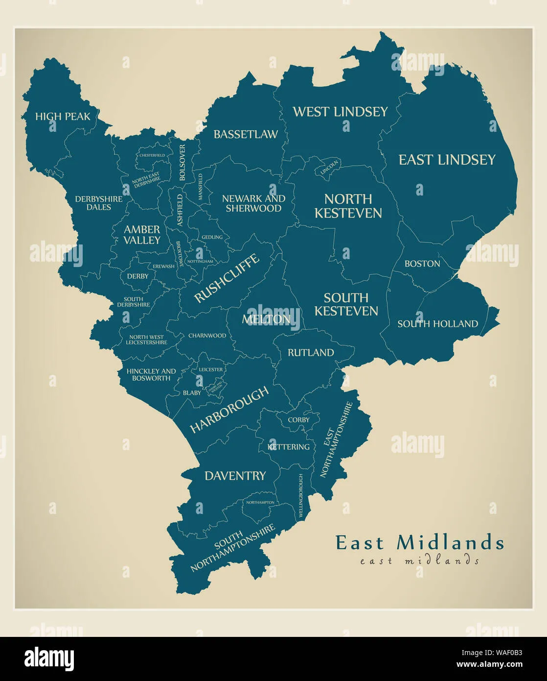 Photo: East Midlands, via c8.alamy.com
A transport authority in the North West rebranded its entire network under a new umbrella identity — Connex Metro, or something similarly purposeful — at a cost that, once consultancy fees, signage replacement, vehicle livery, and staff uniform updates were included, comfortably exceeded £2 million. Journey times did not improve. The app, which had previously been described by users as 'like navigating a website designed by someone who has never used a website', was not replaced. It received a new icon, though. The icon is very clean.
 Photo: North West, via www.hola.com
An NHS trust in the South East unveiled a rebrand in which its previous name — which contained the word 'hospital', helpfully indicating what it was — was replaced with a 'health partnership' title featuring a stylised leaf motif. The leaf, according to the brand guidelines document (forty-seven pages, available on request), represents 'growth, renewal, and the natural vitality of the communities we serve'. The maternity unit it represents has been under special measures for eighteen months.
 Photo: South East, via cdn.britannica.com
The Consultancy Ecosystem
None of this happens spontaneously. Behind every Vitality Sage logo and every tagline about 'journeys, together' is a branding consultancy, and behind every branding consultancy is a pitch document containing phrases like 'authentic visual language', 'stakeholder resonance', and 'a brand architecture that speaks to both internal and external audiences'.
These consultancies are very good at what they do, which is to identify an organisation that is anxious about its public perception and offer it the one thing that feels like action without requiring anything as uncomfortable as actual change. They speak fluent institutional. They understand that the people commissioning the work need to be able to stand in front of a board and say they've done something. The logo is the something.
The fees are, by any reasonable measure, extraordinary. Forty thousand pounds for a new wordmark is considered modest. Six figures for a 'full identity system' — which includes the wordmark, a colour palette, approved typography, a tone of voice guide, and a document explaining how not to stretch the logo — is entirely standard. The NHS has spent, in aggregate, sums that would fund several wards on exercises of this kind. Local councils have redirected money from public-facing services to pay designers in Shoreditch to make their website headers look more contemporary.
The Mission Statement as Parallel Universe
The rebrand invariably comes with a new mission statement, and the mission statement deserves its own moment of attention.
Britain's public sector mission statements have achieved a kind of collective poetry in their studied meaninglessness. They promise to 'put people at the heart of everything we do', which raises the question of where people were previously located. They commit to 'delivering excellence across all touchpoints', which sounds like something a very confident robot would say. They describe a vision of 'a healthier, more connected, more sustainable future for the communities we are proud to serve', which is the verbal equivalent of a stock photo of a diverse group of people laughing in a park.
The mission statement cannot be argued with, because it contains no actual propositions. It is not possible to fail to deliver 'a commitment to putting communities first', because 'putting communities first' has no measurable definition. This is not a bug. This is the entire point.
What A Rebrand Actually Costs
The next time a public body in your area unveils a new visual identity, it is worth doing a small piece of arithmetic. The average NHS district nurse costs roughly £35,000 a year in salary. A rebrand costing £350,000 is, therefore, ten district nurses for a year. A council rebrand at £180,000 is a youth worker for five years, or a pothole repair budget that might conceivably address the crater on the B4196 that has been claiming wing mirrors since 2021.
This is not to say that public organisations should never update their communications or modernise how they present themselves. Clarity of information, accessible design, legible signage — these things have genuine value. The problem is not the logo. The problem is the logo as substitute for the thing the logo is supposed to represent.
A new teal colour scheme does not make the bus run on time. A stylised leaf does not staff the maternity ward. A tagline about journeys, together, does not get you to your destination.
It just makes the waiting feel more branded.